Loading...
Project Overview
I got the opportunity to develop a terrific user experience for the SWR brand's website and app while working on it. We investigated how we can revamp the site's design. offering cutting-edge techniques for producing new components and doing A/B testing on the website.
More people will want to use and, more importantly, continue to use the SWR website if it is made more attractive and user-friendly.
We worked with website analytics, user navigation patterns, and how statics may be used to solve any particular design issues or areas where the website could use some work. .
-
-
UX Research
GA Data
44% of traffic arriving to site comes through the homepage. However, 48% of
these landing visits leave without viewing more content ore recording an
interaction. Across all devices 22% of visits to the homepage progress through
to view the “Mixing Deck”
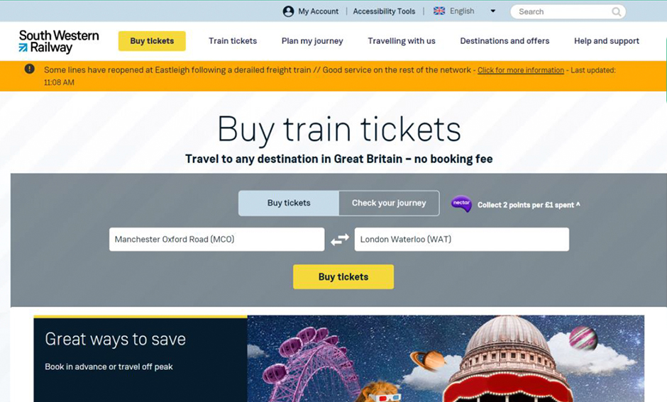
Heuristic Evaluation
Noted that the presentation of the “Buy Ticket” section, first a lack of
distinction between “Buy” and “Check”. As well as the progressive disclosure
of the form creating distraction and the visual hierarchy not aiding user flow.
-
-
-
-
UX Problem Statement
User confusion at the "Buy" and "Check" buttons for searching tickets on the homepage revealed that the current layout of the search fields does not improve user flow. Only 22% of site visits across all devices continue on to view the "Mixing Deck".
Latest CV Avalible
Download CV
Download CV